











Two cells can list the same nominal capacity and the same nominal voltage, yet behave nothing alike under a real load. One holds its voltage under a heavy draw; the other sags into undervoltage cutoff halfway through a mission. A third looks fine on paper but loses most of its usable capacity near freezing. If you compare suppliers on headline numbers alone, you won’t see any of this.
The discharge curve is where that hidden behavior comes into view. Plotted under defined conditions — a specific load, temperature, and cutoff — it shows how the cell’s voltage actually falls as charge is removed. The same curve can point you to the right cell or send you down the wrong path, depending entirely on whether you read it under the conditions that match your application.
This article is a practical guide to cell selection and supplier data: how to read a discharge curve, what changes its shape, which features to prioritize for your application, and how to compare vendors on data that is actually comparable.
Why Nominal Specs Are Not Enough
Qualifying a cell starts with a datasheet, and many teams stop at the headline numbers: nominal capacity and nominal voltage. Both are useful for shortlisting, but they describe where the cell sits on paper, not how it responds to your load. When you qualify cells for a new product, the discharge curve shows the behavior a single number hides: where voltage sits, how fast it drops, and how much charge actually reaches the cutoff under realistic conditions.
So this isn’t about learning battery basics. It’s about answering one question: given two cells that look similar on paper, which one is the better fit for my application? To answer it, you read the whole discharge profile rather than a single headline spec point.
What the Curve Actually Shows
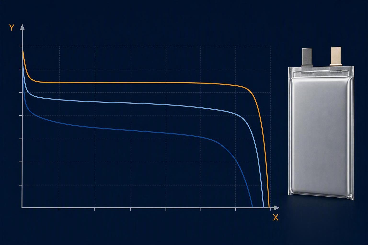
Before the numbers can tell you anything, you need the map. A discharge curve is plotted on a standard coordinate system. The x-axis is discharge capacity (in mAh or Ah) — the charge the cell has released, which maps directly to your runtime. The y-axis is terminal voltage (in volts) — the cell’s live output, which maps to how steadily it can hold your load. Read left to right, the trace follows a predictable arc: open-circuit voltage at full charge, an initial drop as current is applied, a stable plateau through the middle, a sharp tail as the cell empties, and the cutoff at the end.
The curve also changes shape depending on how the cell is discharged. Three modes show up in datasheets:
Constant current. The most common test: a fixed current until cutoff. Expect a quick initial dip, a very flat middle plateau, and a steep final drop. It’s the default factory trace and fits steady IoT, storage, and consumer loads.
Constant power. Fixed power output, so as voltage falls the current climbs. There’s no flat plateau — voltage decays through the whole run instead. This mirrors drones, EVs, and power tools far more faithfully than a constant-current test.
Dynamic load. A varying current profile with periodic voltage rebounds. It simulates intermittent duty like phones and wearables and shows how a cell handles pulse loads and voltage recovery.
Why Curves Can’t Be Compared Directly
A discharge curve is not a fixed property of the cell. It shifts with the conditions under which it is measured, which is why raw numbers pulled from different datasheets are so often not directly comparable — each supplier records its curve under its own chosen rate, temperature, and cutoff. Three variables in particular shape the trace, and they are worth knowing before you compare any two cells.
Discharge rate. Rate is expressed in C, where a 1C rate fully discharges the cell in one hour — 2C in half an hour, and so on. The higher the C-rate, the more internal resistance and polarization losses grow, so the cell shows a larger initial voltage drop, a lower plateau, and less delivered capacity before cutoff. As Battery University explains in BU-501a, capacity and voltage both fall as load current increases. That’s why a cell delivering full rated capacity at 0.5C may deliver only a fraction of that at 5C. So test at a rate that reflects your real load—higher C-rates add voltage sag and eat into usable capacity.
Temperature. Cold lowers ionic mobility and raises polarization, dragging the curve down and left — a lower platform, more sag, and less delivered capacity. In practical terms, a cell that shows full capacity at 25°C may deliver only 60–85% of that at −10°C to 0°C, which is why winter missions so often see runtime cut roughly in half. Heat is a different trade-off: it eases polarization and can nudge early capacity slightly higher, but it accelerates aging over repeated cycles, and sustained high-temperature running in the 45–60°C range brings faster degradation and a real thermal-runaway risk. A curve measured at 25°C alone tells you little about how the cell behaves at −10°C or 45°C in the field.
Cutoff voltage. Where the curve ends defines how much charge counts as usable. A higher cutoff stops discharge earlier, trimming delivered capacity — commonly 10–20% — while keeping the cell away from deep depletion and slowing degradation. A lower cutoff extracts more capacity but pushes the cell closer to its safe limit, risking faster aging on repeat cycles. Two cells with identical chemistry can show different usable capacities purely because their datasheets use different cutoffs.
In other words, curves are only comparable when measured under the same C-rate, temperature, and cutoff voltage. Change any one of these and the numbers will steer you wrong.
4 Curve Features That Matter for Cell Selection
Once the test conditions are fixed, four curve features do the real work. Together they describe how a cell will behave under your load far better than its nominal specs, and they form the core of any selection comparison.
Voltage Platform
Look at the middle of the curve and you’ll usually find a relatively flat region where voltage changes slowly while most of the capacity is removed. That flat stretch is your voltage platform. A higher, flatter platform indicates the cell can hold steady output across most of its discharge, which translates to stable power delivery under sustained load. A sloping or sagging platform signals higher internal resistance and weaker voltage regulation. If your load demands consistent voltage over a long period, platform height and flatness are the first things to check.
Usable Capacity
Usable capacity is how much charge actually reaches the cutoff before the curve ends—read it from how far the curve stretches along the x-axis. It is not the nominal capacity printed on the datasheet. The same cell shows a longer curve at a low rate and warm temperature than at a high rate or low temperature. For runtime-sensitive applications, compare delivered capacity at your real C-rate and temperature, not the number a supplier chose to print.
Voltage Sag
Voltage sag is the immediate drop in terminal voltage when current is applied, especially at the start of discharge or during a current step. Larger sag typically reflects higher internal resistance, wasting energy as heat and pulling output voltage down under heavy draws. For high-power loads, sag often decides the outcome: a cell that holds voltage under a large current draw can sustain the load, while heavy sag may trip undervoltage protection. Keep an eye on both the initial sag dip and how the curve behaves during current steps.
End-of-Discharge Behavior
The end-of-discharge region is where the curve falls sharply as the cell approaches the cutoff. A clean, steep, predictable drop near a consistent voltage makes the cutoff point easy for a BMS to detect, so the system can use the full usable window without uncertainty. A long, soft, or erratic tail means voltage hovers near the cutoff for a while, which complicates state-of-charge estimation and raises the risk of a sudden cutoff surprise. Predictable end-of-discharge behavior can be worth more than a slightly larger nominal number.
Match the Curve to Your Application
Reading the four features is only useful once you connect them to your load. The right curve for a high-power drone battery is not the right curve for a long-endurance EV pack or a stationary semi-solid-state battery for energy storage. Rather than a generic description of each market, the practical move is to group applications by what they ask of the cell, then weigh the features that matter.
Application priority | Examples | Main curve characteristics to check |
|---|---|---|
High power | Agricultural drones, UAV takeoff, EV acceleration | Voltage sag + voltage stability at high C-rate |
Lange Ausdauer | Delivery drones, electric two-wheelers, storage cycling | Usable capacity + platform stability |
Wide temperature | Outdoor drones, cold-climate EVs, off-grid storage | Capacity + voltage stability at temperature extremes |
Start with the high C-rate curves when the load is high-power, and look for small voltage sag under peak current, a plateau that holds steady rather than collapsing at rate, and retained capacity near the application’s peak C-rate. If the curve sags hard or shortens sharply at the rate your heaviest draw demands, the cell probably won’t sustain that duty even if its low-rate capacity looks generous.
Where long-endurance missions dominate, usable capacity and platform stability matter most. Read the low-to-moderate C-rate curves and check how much capacity is delivered before cutoff at your operating temperature. Capacity retention across cycles counts here too, because a platform that slowly loses usable capacity forces you to oversize the pack on day one.
When the operation spans wide-temperature conditions, behavior at extremes outweighs a 25°C snapshot. Compare low-temperature capacity and voltage stability against your coldest operating condition — a cell whose curve collapses at −10°C typically can’t complete winter missions no matter how strong its datasheet looks.
How to Compare Battery Suppliers on Discharge Data
This is where reading the curve turns into a procurement decision.
When two suppliers hand you discharge curves, your first move is not to compare values — it is to check that the curves were produced under identical, fair conditions. Mismatched test conditions are the single most common reason head-to-head cell comparisons mislead buyers.
So the question to ask every supplier is not just “What is the capacity?” It is “Under what test conditions was this capacity measured?” Run every comparison through this checklist:
Same C-rate? Are both curves measured at the same discharge current relative to capacity?
Same temperature? Same ambient and cell temperature for both tests?
Same cutoff voltage? Does each curve end at the same cell voltage?
Same test method? Constant current, constant power, or a defined dynamic profile?
Same cell condition? Same formation, same cycle age, same rest time before discharge?
Same capacity definition? Nominal, minimum, or typical — and at which rate and temperature?
If any answer is no, the two curves are not directly comparable. As research on informative battery datasheets points out, many datasheets report a single value measured under conditions the manufacturer chose, so you should request full test data with the mean and range for capacity and impedance rather than a single headline number.
Miss even one of these checks and the comparison breaks down—at that point you’re really just comparing apples to oranges.
If a supplier can’t or won’t provide data measured at conditions matching your load, treat that as a gap in the evaluation rather than an assumption you fill in yourself. That discipline applies equally to every vendor you consider.
Conclusion
Nominal capacity and nominal voltage are convenient marketing numbers, not selection criteria. The discharge curve offers the insight those numbers hide: how a cell holds voltage, how much capacity it actually delivers, how it sags under load, and how predictably it ends. Read the curve, check the test conditions, and compare suppliers only on matched data.
If you’re evaluating a custom battery solution for your UAV, EV, or energy storage application, the same logic applies: ask for discharge data measured at your voltage, capacity, current, and operating temperature.







 Deutsch
  English
  Español
  한국어
한국어  Français
  日本語
日本語  Русский
  Bahasa Indonesia
  ไทย
ไทย  العربية
  Português do Brasil
  Italiano
  Nederlands